
Using Classical Tamil Letter Forms in Modern Applications
By Muthu Nedumaran Tamil Version
A brief historical note
In 1978, Tamil Nadu introduced a script reform that simplified several consonant-vowel combinations, replacing the traditional composite letter forms with a more regularised arrangement of the consonant followed by a separate vowel sign. Malaysia, Singapore, and Sri Lanka subsequently adopted these changes. While the reformed forms became the official standard in educational and government contexts, the earlier forms never disappeared entirely — they continue to be seen in older publications, religious texts, signage, and the work of calligraphers and designers who favour their aesthetic qualities.
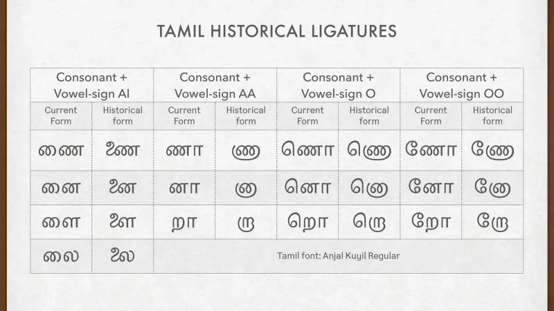
Many Murasu Anjal users have asked me how to use those older Tamil letter forms in their documents and creative materials — posters, invitations, and the like. I hope this article helps explain how these beautiful forms, which some of us still use in our everyday writing, can be rendered in modern applications.
Two styles, one language
Just because these forms were officially changed does not mean they need to disappear from use. They can harmoniously co-exist as an alternative style — much like ligature forms do in other writing systems. This is nothing new. Latin scripts used in English and Malay, for instance, have long embraced multiple forms for the same letter. The lowercase ‘a’ and ‘g’ each have two distinct shapes: one used in school textbooks and handwriting, and another in running text such as articles, stories, and books. Similarly, ligatures like ‘fi’, ‘ff’, ‘ft’, and ‘tt’ appear in many fonts as elegant alternatives to their individual components.
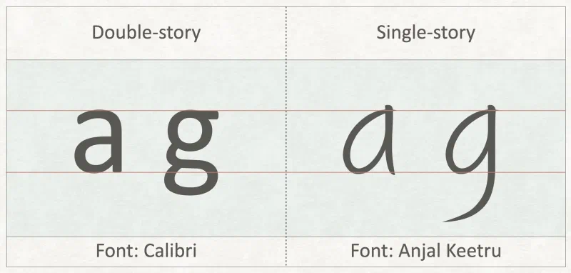
The same principle applies here. The earlier Tamil letter forms are simply another typographic style — equally valid, equally meaningful.
There is also a more fundamental reason to preserve these forms. If we ever need to write about the script reform itself — to say, for instance, “these letters were written this way before the government order” — we need to be able to actually show those earlier forms inline, within our text. A discussion about typographic history that cannot render the historical forms it is describing is incomplete. Beyond writing, there is also the matter of reading. Thousands of books, journals, and publications from before the reform were printed using these classical forms. Without familiarity with them, an entire generation risks being unable to read this body of literature — songs, poetry, novels, academic works, and religious texts that form an invaluable part of our cultural heritage. Scholars, educators, historians, type designers, and anyone with a love of Tamil literature all have good reason to keep these forms alive, and modern font technology makes that entirely possible.
How font technology makes this possible
The good news is that font technology has supported multiple forms for the same letter or sequence of letters for quite some time. Modern word-processing and layout applications are beginning to expose these features through user interface elements that let you choose between forms — much like choosing between number styles such as old-style or tabular figures.
Imagine creating a poster for a musical show featuring Tamil songs from the 1960s, titled தேனான இசை மாலை (An evening with sweet oldies). Wouldn’t it be fitting to set the னா and லை in the style that was in use during that era?
In all my Tamil fonts, I include these forms using the Historical Ligatures feature in OpenType font technology. I also included these ligatures in Apple’s Advanced Typography when I first developed Tamil fonts for Apple platforms.
No special keyboard input required
The most important thing to understand is that these shapes do not require any special keyboard input. The meaning of the letters is exactly the same — only their appearance differs. Just as a single-storey ‘g’ and a double-storey ‘g’ are typed identically, அண்ணாமலை (Annamalai) is typed the same way whether you want the ணா and லை in the current form or the earlier one. Once you have typed your text, simply select it and apply the appropriate typographic feature to render it in the classical style.
See it in action
I have made screen recordings showing how this works in several applications, and they are presented in the video below. If you use these ligatures in other apps, do record them and send them over — we can use them to help other users. Better still, post them on social media and send us the link so we can share them on our pages.