
Tracking and Tamil Vowel Signs
By Muthu Nedumaran Tamil Version
While experimenting with typographic layouts for Tamil, I ran into a subtle problem: what should happen to spacing vowel signs when you apply tracking (letter-spacing) to Tamil text? This has come up in discussions before — among type designers and script engineers — but no conclusive decisions were made. The community mostly stuck to the linguistically correct approach of keeping marks bonded to their base. I wanted to explore whether there is room for a more nuanced answer.
The Setup
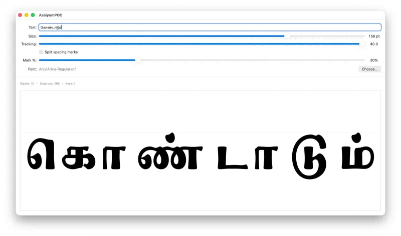
I built a small tool that lets me shape Tamil text with HarfBuzz and adjust tracking interactively with a slider. Tracking adds uniform space between characters and is common in display typography for titles, logos, and posters. It works intuitively for Latin scripts. For Tamil, it gets complicated.
The Problem
Tamil vowel signs like ா (aa), ை (ai), and ே (e) are spacing marks — they have their own advance width and sit adjacent to their base consonant. Text shaping engines (such as HarfBuzz and CoreText) correctly group them into the same cluster as the base, meaning the cursor treats them as a single unit.
When tracking is applied only at cluster boundaries, the base-to-mark distance stays constant while the inter-cluster gaps grow. This is orthographically correct — these marks are bound to their consonant — but at higher tracking values, the result looks uneven. The marks cling to their base while everything else drifts apart.
Non-spacing marks are a different story entirely. The pulli (்) is the classic example in Tamil — it sits above the base consonant with zero advance width and must always stay bonded. In some fonts, the ii-vowel sign (ீ) is also designed as a non-spacing mark. There are no issues with these; they are anchored to the base and should never be affected by tracking. The tension this post explores is specific to spacing marks — the ones that occupy their own horizontal space adjacent to the consonant.
Three Options
I set up three modes to experiment with:
- Keeping spacing marks fully bonded to their base (factor 0%).
- Giving them the full inter-cluster tracking amount (factor 100%).
- A fractional approach where marks receive a percentage of the tracking — say 30% — creating a gentler visual distribution.
The fractional approach turned out to be the most interesting. At around 25–35%, the text feels balanced without breaking the visual connection between mark and base. But — and this was the real finding — the ideal value varies by font. Some typefaces with tighter mark placement look best at 0%. Others with more generous spacing benefit from 30% or even higher. There is no single correct answer.
Letting the User Decide
Typography serves communication, and the person setting the type is the best judge of what works for their context. Rather than prescribing a default, exposing this as a continuous control — a simple percentage slider — lets designers and typographers find the right balance for their font, their text, and their intent. What is orthographically correct and what is visually appealing need not be in conflict if the tools give us room to navigate between them.
Current tools that support tracking tend to be binary — they either respect cluster boundaries fully or ignore them completely. There’s no middle ground. If this kind of fractional control is a worthwhile feature, it deserves more discussion so it gets the attention of the application vendors who could make it happen.
It’s worth noting that this entire discussion assumes horizontal layout. In a vertical layout, splitting spacing marks away from their base would produce awkward results — imagine the components of கொ — the kombu (ொ), the consonant க, and the kaal (ா) — stacked vertically. The visual logic breaks down completely. Tracking is inherently a horizontal-axis operation, and that is the scope of this post.
This experiment focused on Tamil, but the same tension exists in Malayalam, Sinhala, and Southeast Asian scripts that use spacing marks. I hope to explore those next.